In healthcare settings, colour has a myriad of different functions, but it is especially visible within interior architecture environments, where it is often deployed as an assistive tool for wayfinding or to promote feelings of calm in specific spaces, usually through shades of green or blue. Lightness, darkness and hue were demonstrated to also be important as early as 1859 when Florence Nightingale observed the health impacts of daylight via hospital windows.
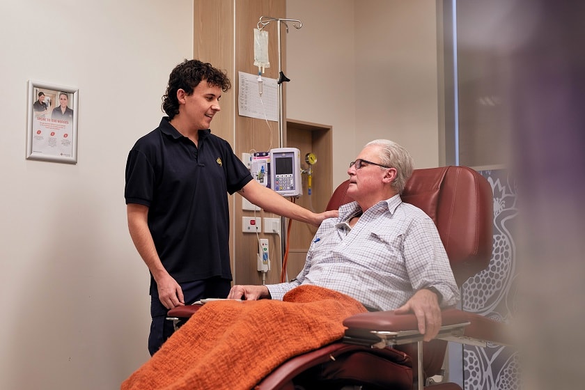
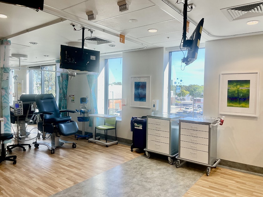
Artwork installations at the St John of God Midland Public and Private Hospital, Chemotherapy Unit, and St John of God Murdoch Hospital Cancer Centre provide opportunities to further explore these ideas and the impact of colour, tone-lightness and darkness, and hue through artworks in our cancer care settings.
While colour is an important element of every artwork, it is not always the most dominant feature.
The artworks for the Chemotherapy Unit and Cancer Centre have been specifically selected with colour as a dominant feature creating opportunity to understand the impact of colour on health and wellbeing. The following artworks are a selection of the works on display:
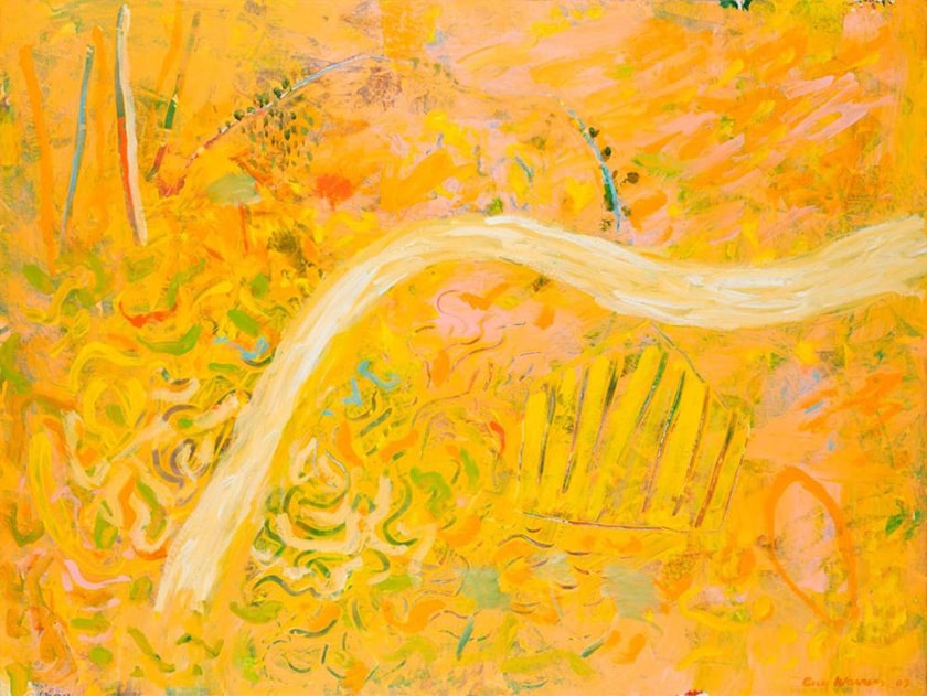
Colour and texture
Guy Warren, Pathway to the Chalet of delights, 2003, oil on canvas, St John of God Health Care Art Collection
In his painting ‘Pathway to the Chalet of delights’, 2003, Australian artist, Guy Warren, takes a palette of warm yellow to paint his feelings of being within and remembering rainforest landscapes. Warren has bathed this scene with golden warmth, leading eyes through the path to delight and discover an abundance of colour, texture and painterly layers. Warren described his experience of painting as an imagined walk through a rainforest. The quality of immersion comes from the highly textured combinations of visible brush strokes, contrasting colours and overlapping shapes.
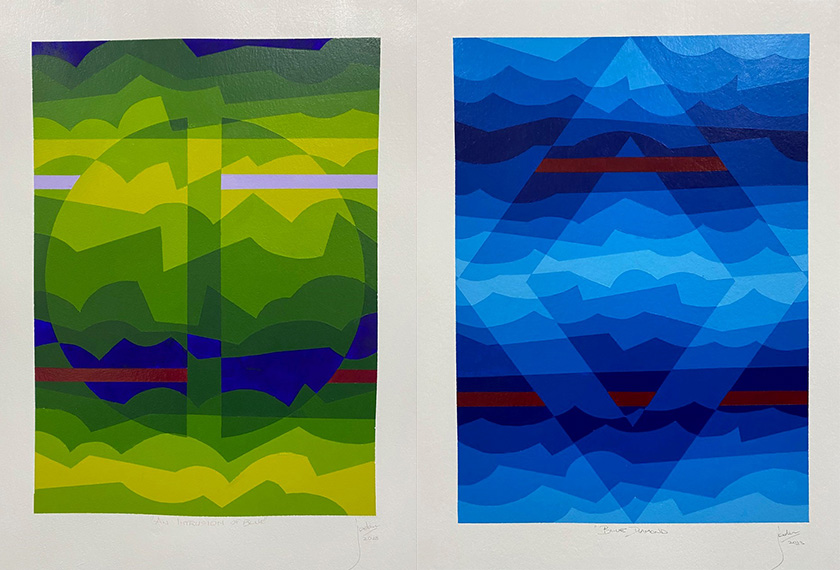
Colour and line
Col Jordan, Staccato series, 2022-23, acrylic on paper, St John of God Health Care Art Collection
In his staccato series Australian artist Col Jordan pairs pure colour with geometric lines and interlocking shapes. Each artwork is a visual puzzle that entices the eye and encourages closer looking. At first these paintings might look like computerised graphics or posters, but, they are in fact, created carefully by hand. Using masking tape on paper, Col Jordan builds up layers of acrylic paint in sections to create graduating layers of colour and tone.
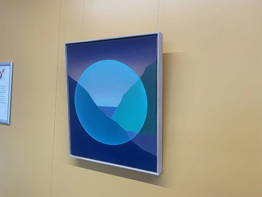
Colour and value
Dapeng Liu, Landscape of the Future, oil on canvas, 2022, St John of God Health Care Art Collection
In his artwork 'Landscape of the Future', Australian artist Dapeng Liu depicts his interpretation of a mountain and waterscape scene. Liu has drawn on aesthetic influences from Chinese landscape painting to share this vision. The sun is rising, suggestive of restoration and new beginnings. Liu creates strong colour gradients within his work through smoothly blended oil paint. In 'Landscape of the Future' the skies colour gradient emphasises the passage of time as it gradually recedes from warm pink to deep purple.
Colour and shape
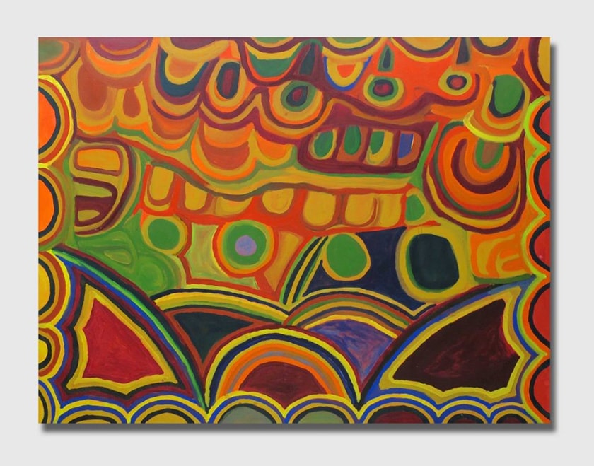
Nyuju Stumpy Brown, Warrla II, 1998, acrylic on canvas, St John of God Health Care Art Collection
'Warrla II' demonstrates Njinju Stumpy Brown's characteristic chromatic and high key palette created through washes of acrylic paint. She used broad sweeping motions to depict jila/waterholes, sites, sand and bush foods and repeated round or circular motifs to represent the locations of waterholes and soaks. The 'wet on wet' painting technique and bold swathes of colour became definitive features of the Fitzroy Crossing style. Njinju Stumpy Brown painted in an authoritative way with a sense of pride that came from her position as a law woman within her community.